
Collaborators: Nathan E. Lewis, Kimberly Robasky, et al.
Below are some of my visualizations that have been featured in various locations around the web and beyond.
Click the image to go to the website.
|
The CASC 2023 Brochure featured the ImmCellFIE tool, a collaboration with Nathan E. Lewis and his lab from UCSD, which enables users to map gene expression data to biological pathway models and provides visualizations to explore the output. You can read the STAR Protocols paper published on ImmCellFIE here.
Collaborators: Nathan E. Lewis, Kimberly Robasky, et al. |

|
RENCI created a blog post on my work developing a tool to segment nuclei from 3D microscopy images of the brain, with Guorong Wu and Jason Stein at UNC. You can read the BMC Bioinformatics paper published on the Segmentor tool here.
Collaborators: Guorong Wu, Jason Stein |
 |
The CASC 2022 Brochure also featured the Segmentor tool. |

|
I worked with Professor Tim Chartier to devlop an interactive website to create tilings of a plane that help students learn about homogeneous coordinates and symmetries.
The website was based on a similar interactive website from the Shoder Education Foundation.
Collaborators: Tim Chartier |

|
I worked with Professor Tim Chartier to devlop an interactive website for the touching puzzle, which he uses to help teach concepts related to computational complexity.
Collaborators: Tim Chartier |

|
I developed a directed chord diagram to help Professor Tim Chartier's Cat Stats group at Davidson College visualize assists in basketball games.
These visualizations became a feature via "Assist Map Mondays."
Collaborators: Tim Chartier |

|
I worked with Professor Tim Chartier from Davidson College to develop this interactive website to help teach concepts related to subdivision surfaces, often used in computer graphics.
This work was used to help illustrated our article, "Pixar's Linear Algebra," published in IMAGE, the bulletin of the International Linear Algebra Society.
Collaborators: Tim Chartier, Tabitha Peck |

|
I worked with Professor Tim Chartier from Davidson College to develop this interactive website to help teach linear algebra concepts.
Collaborators: Tim Chartier |

|
The CASC 2020 Brochure featured this visualization of the CCFA Explorer tool for investigating research topics created by patients with IBD.
Collaborators: Charles Schmitt, Laura Christopherson, IBD Partners |
|
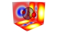
The CASC 2015 Brochure featured this visualization displaying
the difference between using relativistic and non-relativistic calculations when computing the charge distribution of a molecule
containing Ruthenium, which is being investigated for applications in solar fuels. This visualization was also created using
Voluminous.
Collaborators: Jeff Tilson |
|
International Science Grid This Week featured the Visualize Particulate Matter (VPM) visual analytics tool I created along
with collaborators from RENCI and the Institute for the Environment at UNC-Chapel Hill. This tool is designed to help used to understand
particulate air pollution, with the ability to correlate real and simulated data.
Collaborators: Uma Shankar, Alexis Zubrow, Richard Ross, Steve Chall, Jeff Heard |

|
The CASC 2010 Brochure featured this visualization of the simulation of cochlear implant electric potentials, from a collaboration
with Charles Finley from Otolaryngology and Biomedical Engineering at UNC-Chapel Hill.
Collaborators: Charles Finley, Mark Reed |

|
American Scientist did a feature on Alan Huber that included some images from our collaboration while he was adjunct professor with
the Institute for the Environment at UNC-Chapel Hill. This work involved the visualization of simulations of air flow in downtown Manhattan.
Collaborator: Alan Huber |

|
The Endeavors research and creativity magazine at UNC-Chapel Hill did a
feature on visualization that included some of my work, including my dissertation
work on Flexible Occlusion Rendering, a collaboration on cochlear implant visualization with Charles Finley
from Otolaryngology and Biomedical Engineering at UNC-Chapel Hill, and the work with Alan Huber mentioned above.
Collaborators: Charles Finley, Eric Knisley, Alan Huber, John P. Clarke, Russell M. Taylor II |

|
The TeraGrid '08 Visualization Gallery: The Beauty of Science featured this visualization, which displays
the difference between using relativistic and non-relativistic calculations when computing the charge distribution of a Uranium atom.
The Voluminous visualization tool I developed for creating these images can be downloaded
here.
Collaborators: Jeff Tilson, Eric Knisley |

|
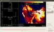
International Science Grid This Week featured this image from the MatchMaker visualization tool I developed at RENCI
for its image of the week. This tool displays live data of the progress of jobs being run on the Open Science Grid.
Collaborators: Mats Rynge, John McGee |

|
The website of the Computer Integrated Systems for Microscopy and Manipulation (CISMM) group at UNC-Chapel Hill featured this visualization
of data extracted from a video of mucus flow on a human lung cell. It uses dense streamlines to show the direction of the mucus flow.
Collaborators: Brian Eastwood, David Hill |